Green Watch
Scales over our eyes: Using graphs to frighten people about global warming
We’ve been led to believe that the earth faces a global warming catastrophe that will flood coastal cities, turn farmland into desert, and unleash the forces of nature to punish mankind for its use of carbon-based fuels. But, in fact, the opposite is true: Current projections show that temperatures will plummet in just the next few days.
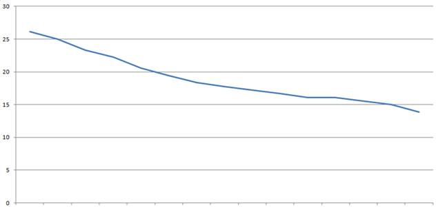
Here’s the chart, based on data from the online edition of The Washington Post, that proves I am right. It shows how the temperature in Washington, D.C. fell by half in just 15 hours between yesterday afternoon and this morning. By half!
This chart shows the temperature’s plunge in D.C. between 4 p.m. yesterday and 7 a.m. this morning.
If this trend continues, there will be no temperature at all in Washington by 10 p.m. tonight (Thursday).
…or, rather, the temperature will fall into the negative range. At that rate of descent, the City of Washington will experience, by 5 a.m. Tuesday, the lowest surface temperature ever recorded on Planet Earth. By Sunday, November 4, at 6 a.m. (after the switch back to standard time), my office at the Capital Research Center will be the temperature of liquid nitrogen, and, by 9 o’clock on Election Eve, D.C. will be colder than Pluto, which could cause the election to be canceled, potentially denying President Obama the District of Columbia’s three electoral votes.
OK, I’m pulling your leg. See what I did there?
First, I picked the times in the past 24 hours with the maximum and minimum temperatures in D.C. (times “on the hour,” anyway). Those times are 4 p.m., when the temperature was 79 degrees Fahrenheit, and 7 a.m., when it was 57 degrees Fahrenheit.
Then I converted the temperatures to the Celsius scale, which changed the 4 p.m. maximum to 26.1 degrees and the 7 a.m. minimum to 13.9 degrees. That made it look as if the temperature would be cut almost in half.
Then I went beyond the data actually displayed on the chart to make a prediction unsupported by the evidence. I used the magic of extrapolation to make a doomsday forecast based on the assumption that the fall in temperature would continue all the way to near-Absolute Zero.
At least I didn’t use one trick often used by scientist-activists: I didn’t just make up the numbers. At least I used actual temperature numbers from actual meteorologists. (News media meteorologists, unlike scientist-activists, tend to be trustworthy because they are held accountable for the accuracy of their predictions. They make mistakes, but they don’t lie.)
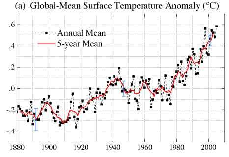
Now let’s take a look at the chart that’s frequently put forth as proof of Catastrophic Anthropogenic Global Warming theory.
The data underlying the chart have legitimacy as the “official” U.S. government figures and are available from the National Aeronautics and Space Administration. (The data are here.) NASA is the government agency that was supposed to run the U.S. manned spaceflight program – may it rest in peace – but recently it re-imagined its mission to include conducting outreach to the Muslim world, outsourcing its work to companies owned by people with political connections, and promoting a belief in global warming theory.
For purposes of this post, let’s accept that these numbers are real. Let’s assume, for the moment, that NASA personnel and their cohorts at organizations like the United Nations’ Intergovernmental Panel on Climate Change possess the ability to calculate mean surface temperatures worldwide, down to one-hundredth of a degree as they claim, all the way back to 1880. (Perhaps they use an infinite number of thermometers, plus a time machine.) Given those assumptions, let’s look at how the numbers are presented in the famous chart.
Notice that the X axis starts with 1880. Why start with 1880, and not 1800 or 1943 or any other year? Perhaps it has something to do with the Little Ice Age, a period of cold weather that ran from the mid-16th to the mid-19th centuries – or, by some calculations, the mid-14th to mid-19th centuries – ending shortly before our charted period begins. If the world were coming out of such a cold period, one would expect a period of warming – right? Catastrophic Anthropogenic Global Warming theory depends for public support on the idea that earth once had a paradisiacal climate, one that mankind is in the process of ruining. If there are any data that suggest otherwise, well, we can just chop that part off the chart.
Notice anything about the Y axis, i.e., the scale on the chart’s left side? The scale appears to run from approximately -0.5 to approximately +0.7 degrees. It’s just big enough to contain the graph that goes from -0.43 to +0.62. That makes the supposed temperature increase look really big. It’s practically bursting out of the box that contains it!
Notice, also, that the numbers on the Y axis are unrelated to any standard temperature scale. They’re not degrees Fahrenheit or Celsius or Kelvin or any other scale that you might have studied in high school or college. What exactly are they?
It turns out that they’re degrees of “anomaly” – degrees above or below the rough average temperature for a base period, the years 1951-80. That standard is arbitrary. Any set of years could have been picked and, indeed, other agencies use different periods for the base. But one advantage of using 1951-80 as the base is that it was a relatively stable period between times of apparent warming. It distracts from the fact that, if the figures are real, there was relatively fast warming from 1911 to 1947 followed by an unexplained period of more than 30 years of non-warming. Interestingly, 1982 was actually cooler than 1943 or 1953, according to the NASA figures.
So there’s nothing special about the pluses and minuses on the chart. The figures could just as well have been expressed as all pluses from a lower baseline, or all minuses from a higher baseline, or in degrees Kelvin, which is the standard for scientific measurements.
Kelvin is the Celsius scale re-set to zero at -273.15 degrees Celsius, the point at which all thermal energy is gone. In other words, the Kelvin scale’s zero really is zero. The Celsius scale, in contrast, has its zero at a more-or-less arbitrary point, the freezing point of water at sea level, and puts its 100 at the equally arbitrary boiling point of water.
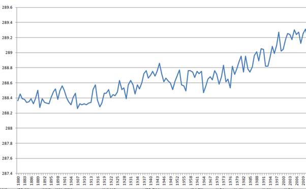
One figure cited as the average surface temperature for the 20th Century is 15.5 degrees Celsius, which translates to 288.65 degrees Kelvin. That figure is just a guess, of course, as are any such figures, but you have to start somewhere, so let’s use it in our calculations. If you re-enter the NASA figures in a Microsoft Excel spreadsheet, adjust them for the Kelvin scale, and plug in that 20th Century average of 288.65 degrees Kelvin, you get this chart:
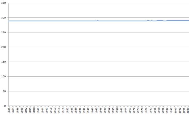
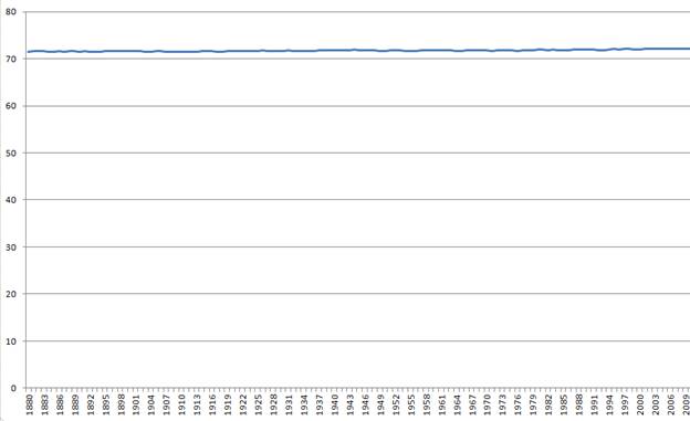
That’s a little closer to a fair representation of the NASA figures, but note that the Y axis runs from 287.4 degrees to 289.6 degrees. In drawing the chart, the Excel software automatically chops off the area below 289.6 degrees, to make the chart easy to read. What if you extend it all the way to zero?
You get this:
Well, that makes a difference, doesn’t it?
Even using the NASA data, you get a chart that appears to show no change at all. That’s because the difference between the 1880 figure (288.3 degrees Kelvin) and the 2011 figure (289.1 degrees Kelvin) is too small to see on a chart like this, unless you chop off the bottom and stretch the middle part.
That doesn’t mean that the shift, which works out to a breakneck one-degree-every-158-years, isn’t significant. Small factors can have big effects. (Whether the NASA climate figures are legitimate in the first place, whether the purported shifts are significant, whether the causes are natural or artificial or mixed, whether the consequences are good or bad or mixed, whether negative effects can be avoided, and whether they can be avoided by means consistent with peace and prosperity and freedom – these are matters for another discussion.) However, displaying the data this way puts the global warming issue in a different perspective, which is why this is probably the first time you’ve seen a chart like the one above with its near-flatline.
Some might say that this representation is unfair. It is, of course; I picked a scale that minimizes the supposed warming, as the people who did the standard chart picked a scale that maximizes the appearance of warming. But what if you used a narrower scale, one based fairly on the actual range of temperatures on the surface of the earth?
Such a scale exists. The Allen scale places its zero point at -89.2 degrees Celsius, which is -128.6 degrees Fahrenheit, the lowest surface temperature recorded on earth (at a Soviet station in Antarctica). Its 100 point is at 56.7 degrees Celsius, or 134 degrees Fahrenheit, the highest earth surface temperature reliably recorded (in Death Valley).
On the Allen scale, the NASA data look like this:
Still almost flat.
Keep in mind that the chart above displays the same data as this one:
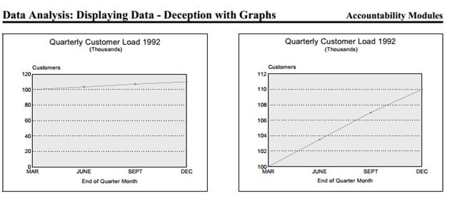
Manipulation of graphs is a common problem – common enough that the Texas state treasurer’s office has a publication, posted here, to teach people to recognize this kind of fraud. The publication gives this example. One chart shows slow growth in a company’s customer load, while the other shows a dramatic increase.
As you’ll notice if you look carefully, the two charts display precisely the same information in very different ways.
Many of the most effective magic tricks involve chopping or stretching the display area or depriving the target of reference points. Smoke and mirrors aren’t necessary. Sometimes all you need is a misleading graph.

